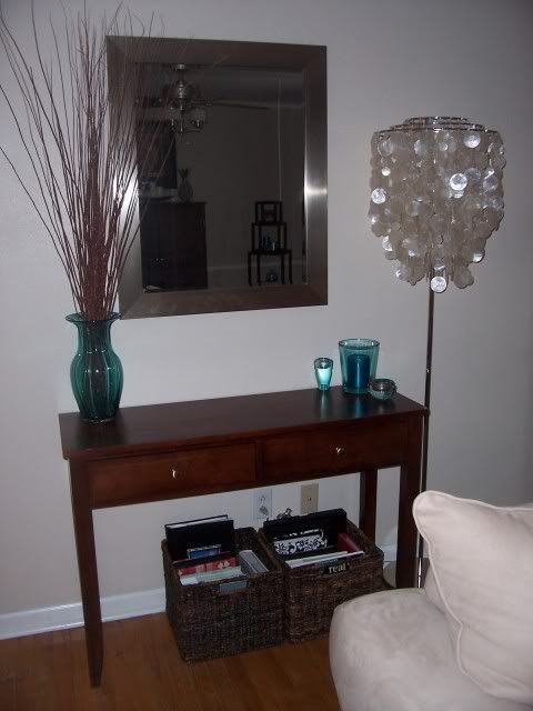
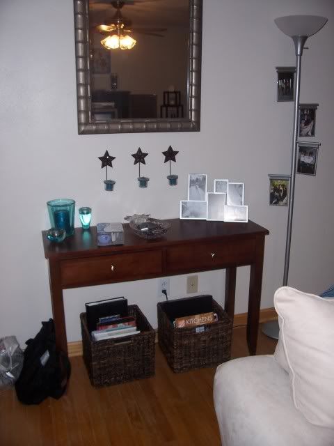
Fresh into our new home ownership, here you're looking at our very first entryway set-up! My, oh my have we come a long way!
Okay, so here we see that the old lamp had to hit the road, a new mirror from Target came to live with us, and one of my favorite gifts ever {the capiz lamp from Maw maw and Paw paw} helped spruce up the space. Still not sure, and definitely not "right", but I was getting there!
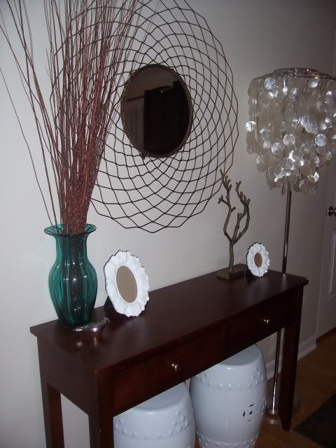
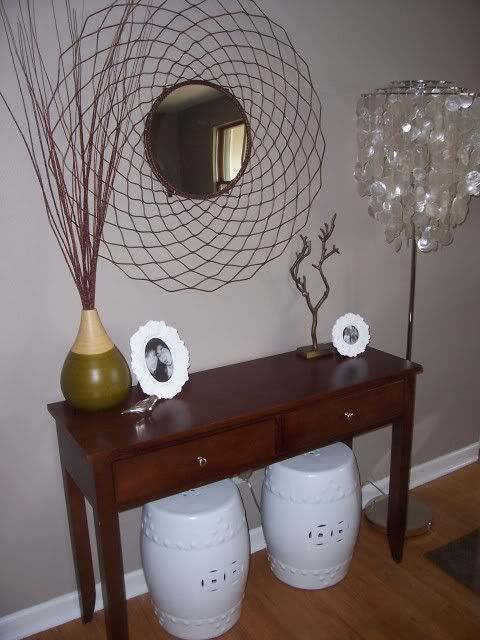
The old mirror was nice, but this round mirror was even better! I still love that circle mirror even though it's moved to a new place in our home. I happen to think that was the best $29 I've ever spent! Oh, and in this version you can see the Urban Outfitters' branch made its first appearance. It's a favorite and has made it through more transformations, too. Love it! And I almost forgot, those are the garden stools that I lovingly referred to as "extra seating"! Dave's still not letting me live that one down.

And then like that, one day "it" happened, the blue and brown had to go. With this little ol' vase, I started to usher in a new time in my design life. I started being drawn to colors that I never thought I'd love and inching away from what I thought I'd always liked. This picture makes me smile knowing how my style started to transform around this time...
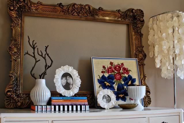
A big overhaul happened when we got rid of the generic Target console table {it resides as a desk at my in-laws now} and replaced it with a craigslist dresser that I painted!
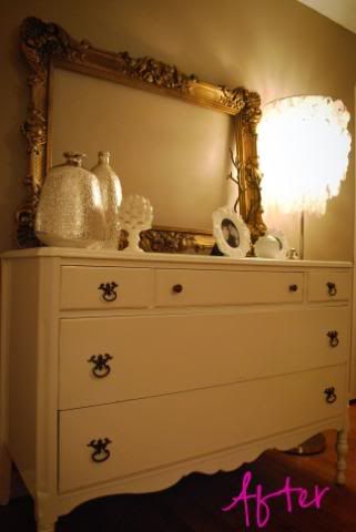
A new dresser=new styling, and this little set-up lasted for quite a long time considering how I manipulate things around here!
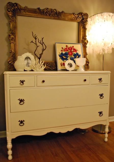
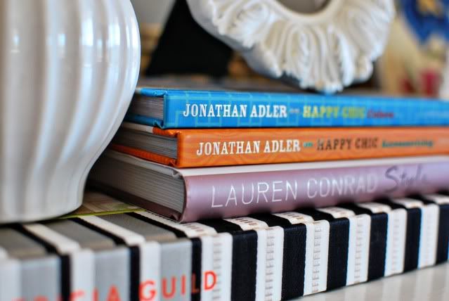
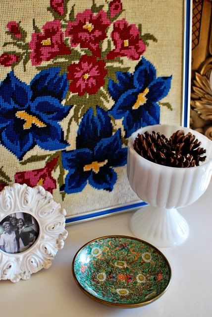
And now, you're brought up to speed! I rearranged a couple things after Christmas with some books I received and also added a small thrifted ceramic bowl.
You know, when I bought that frame off of craigslist I had every intention of putting a mirror in it. Obviously that never happened but I still am thinking about doing it. Thoughts?
Have a very happy Tuesday, everybody!
xoxo

33 comments:
I think it looks great and it's amazing to look back through old photos and compare styles from the past to the present. :)
i absolutely LOVE seeing the evolution of your style and of your entry (and your photography skills as well!). this is so fabulous! I really like the frame with out a mirror, it looks unexpected and eclectic. but it would be just as lovely with a mirror as well.
Progress is a good thing. It you have come a long way...but it was well worth it!
Mr. Goodwill Hunting
Oh.....not only do I love a transformation but I Love Love Love an evolution! I think it is a great little timeline that documents your evolving style and chic design eye. Great post my dear!
Cheers~
e
Love love love it!!! What a beautiful entry!!
I am kind of loving just the frame, with no mirror!
Love this progression of your entryway and your style! It's always fun to look back and go, wow I thought that was stylish? :) Your current entryway is very very gorgeous and you pull off the mirrorless frame beautifully. When I see old photos of our house, everything just looks sooo messy because we had NO storage at all!
Where did the awesome circle mirror go??
Beautiful! Joi, you have such a great eye. The mirror may open up the space a bit more and give you some extra light. However, I do like the look of an empty frame.
HellllOO! That frame is outstanding. Wowsas.
I think it is fine without a mirror in it, but having a mirror in that location would be nice and would add even more dimension to it. I say go for it!
I loved this little style evolution! It's so great to be reminded that beautiful interiors (like yours) don't just appear over night. :) And I like the frame without a mirror, but I'm sure it would be great with one, too. The little pops of color you've brought in through accessories are so great!
Love it! And so much storage in that dresser...definite upgrade. :)
I bought a very similar frame at a thrift store and ended up putting a heavy piece of artist's board then sprayed it with chalkboard paint. I used it at my wedding and wrote our menu on it. Now I don't know what to do with it! ha ha. I like the empty frame though with your set up.
So many changes - how fun to have the pictures to be able to go back and look at them! It looks really really good now!
Love the fresh updates!
You've come a long way my dear! I love it as is, I wouldn't put a mirror in it.
i loved seeing the picts of how it progressed:) of course it looks fab, and i love the frame as is~
WOW...you've come so far! I love it!
Great show of your style and its evolution....I feel like that has happened to me as well! I like the pinecones. I have kept some around for decor for a winter look past Christmas!
I love the progression of your entry. I didn't realize there wasn't a mirror in the frame. I just automatically assumed there was. I wish I could find things like that on my craigslist.
www.mysouthernlife.blogspot.com
I love seeing all the 'incarnations' your entryway has gone though and love its current stage! :)
Gorgeous! There must be something in the air, I've been piddling around trying to spice up my entry. It's in a sad state right now.
Aww, that was fun! You have such great taste. What ever happened to your bamboo dresser re-do? I'm really waiting to see that after shot!
What a great post to showcase your growth and your style. I love it! :) Did you upgrade your camera along the way too.... the most current pics look beautifully exposed.
Wow you have realy come a long way! The dresser looks great and I am sure provides alot more storage! Well done XX Samantha
I really do adore that frame!! Love this space in your home! It's perfect!
xx
Wow! What a change. All the options look great. You have such great style. I just need you to come to my house and help me, k?
Thanks everybody! You guys are so sweet!
It is so cool to see how your style has changed and grown! It looks so great!
I love the final product! A very cute vignette.
It was really cool to see how everything evolved over time.
An antique mirror would look great with the entire design you've got going with the entryway...
Fabulous!!!! I love seeing the evolution of your design style.
How are the Jonathan Adler books? I'm thinking of snagging them.
www.turnuptherad.blogspot.com
Fun to see you go through your different styles. Love the end result.
I love the frame empty! It has such presence just the way it is.
Post a Comment